

Check out my latest projects below
Boston Gun Shootings Dashboard
(TABLEAU)
This dashboard provides an analysis of gun shootings in Boston over the years with interactive filtering and visualizations.

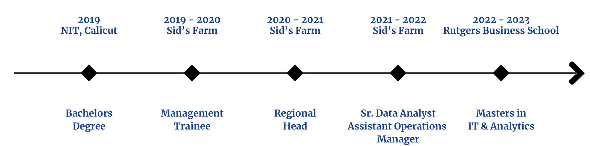
Data Analyst | Business Intelligence Analyst
Graduate Student | Tech Goes Home @Sreeharsha
 Welcome to my portfolio! I'm Sreeharsha Dakkili, a graduate student in Business Analytics with a strong passion for transforming data into meaningful insights. My expertise spans SQL, Python, Tableau, and Excel, and I've had the opportunity to work on diverse projects—from crime analysis dashboards in Boston to comprehensive studies of US election data and the Boston Marathon. My focus is on using data to solve real-world problems, drive business decisions, and create impactful visualizations. I'm excited to share my journey, skills, and projects that reflect my commitment to data-driven excellence.
Feel free to reach out, even if it's just to say hi!


This dashboard provides an analysis of gun shootings in Boston over the years with interactive filtering and visualizations.
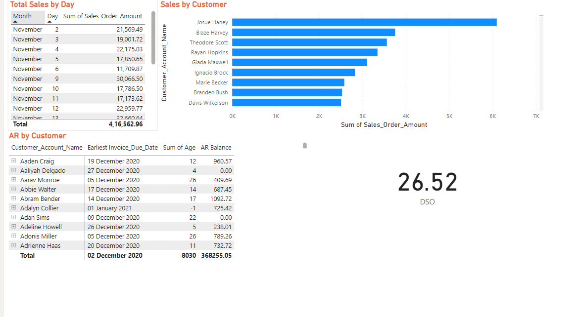
This Power BI Executive Summary Dashboard comprehensively overviews key performance indicators (KPIs). Users can seamlessly navigate between dashboards, each focusing on a specific area: Customers, Sales, Operations, and Finances.
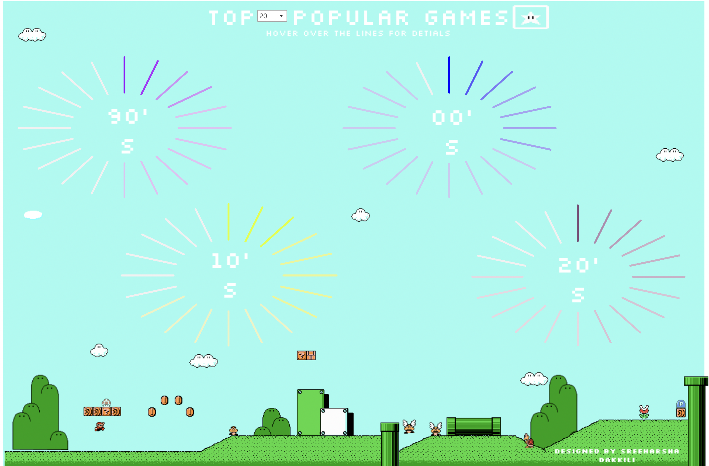
This Tableau dashboard visualizes Top N Games as it gives the flexibility to the user to choose how many top games they want to see decades wise. I used Figma to design the dashboard. I used start burst chart to visualize the games.
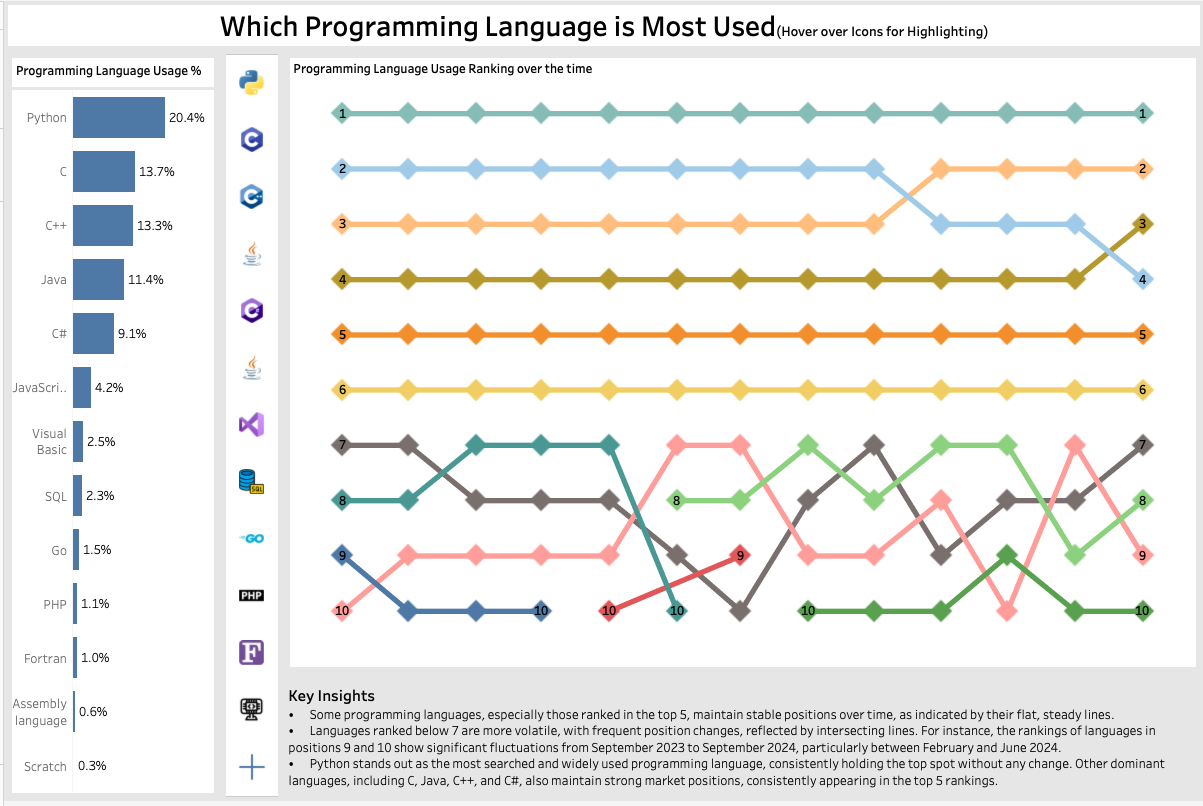
This dashboard analyzes trends in programming language usage! 📊 This is my first-ever bump chart, and I really enjoyed learning the intricacies of this visualization. I learned building a bump chart to effectively visualize trends in rankings over time. Got a solid understanding of number formatting, especially when working with percentages to ensure clarity in data representation.

This dashboard visualizes the Forbes Innovative Companies and provides an interactive experience for users to explore and analyze the data.

This project visualizes the House sales in King County, Washington, US. The Dashboard helps the user to analyze House Sales, Distribution of prices and a calendar heatmap to visualize the average sales price.
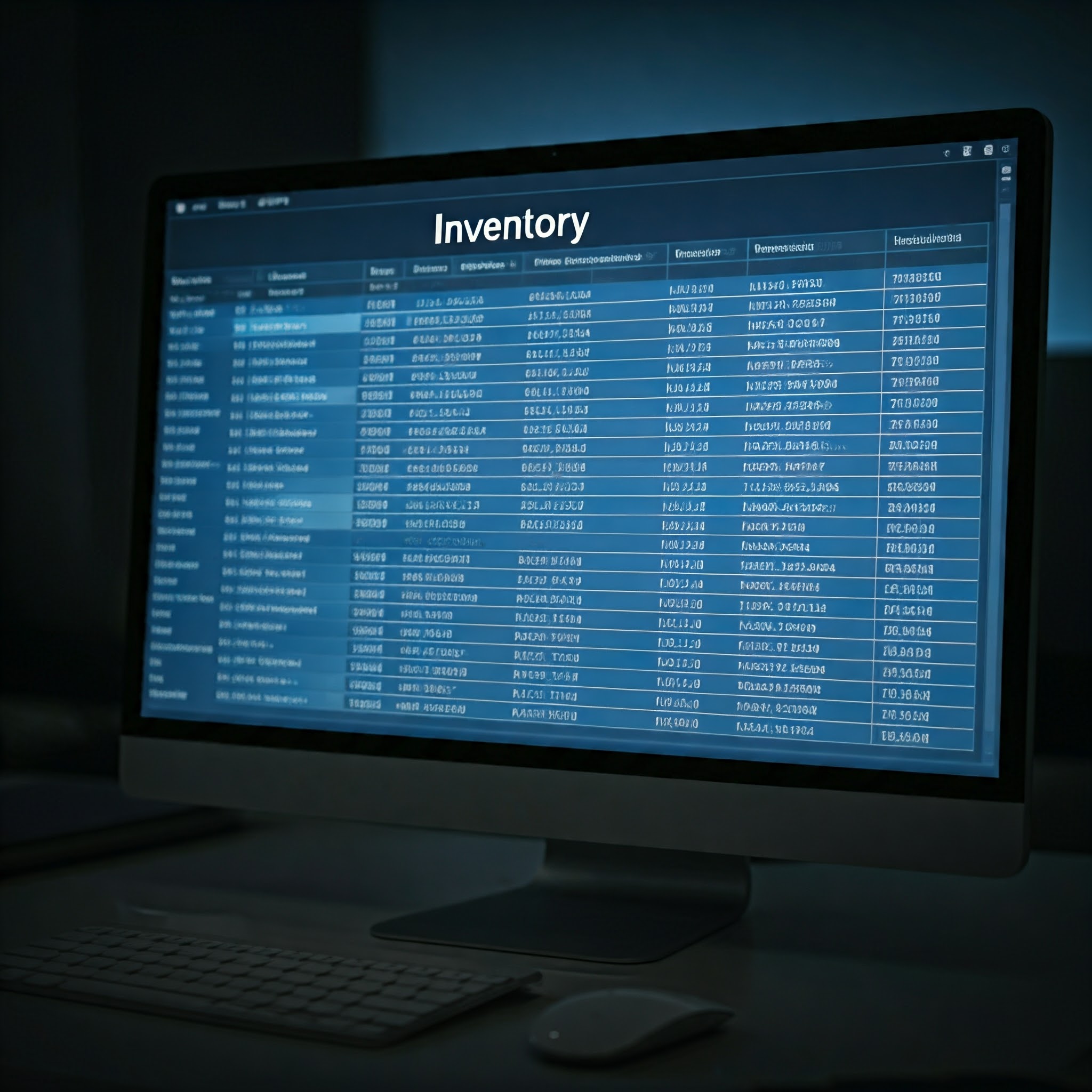
I used MySQL to create a customized Inventory Management System for a non-profit, achieving a 0% reduction in food wastage. Implemented stored procedures to identify expiring products, enhancing organizational efficiency.

I have used Python to perform Exploratory Data Analysis and Predictive Analysis on the Titanic dataset. I have used Logistic Regression to predict the survival of the passengers.

I have used Python to perform clustering on the wine dataset to identify the different types of wines and their characteristics.
I have used Python and R to analyze a huge movie dataset to find correlation among various factors which contribute to the movie's success.